Modern Press is a family‑owned printing and design firm in Albany, NY that was founded in 1946. When we hit our 70th anniversary in 2016, we decided it was time for a rebrand.
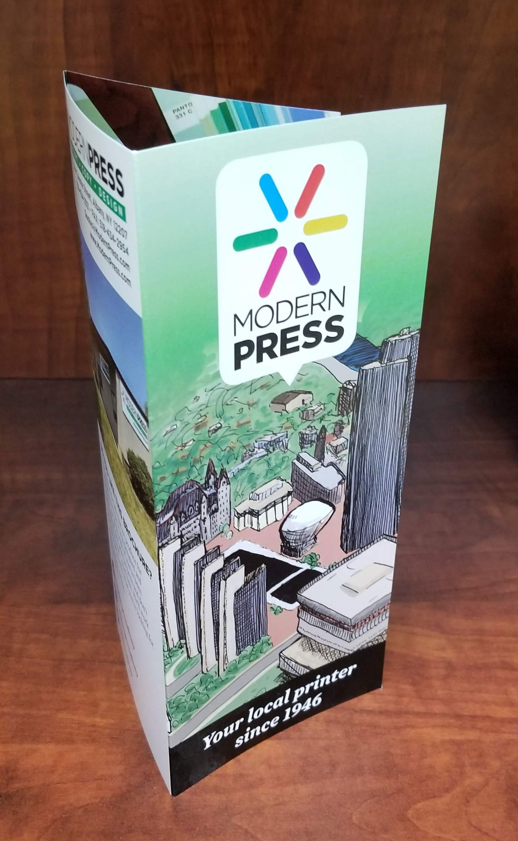
I began with the logo, updating the typeface to the modern sans-serif Gotham. I then changed the color order within the asterisk to be to triads- Cyan, Magenta & Yellow overlaying Red, Green & Blue to symbolize both the classic print color space and the modern screen color space.
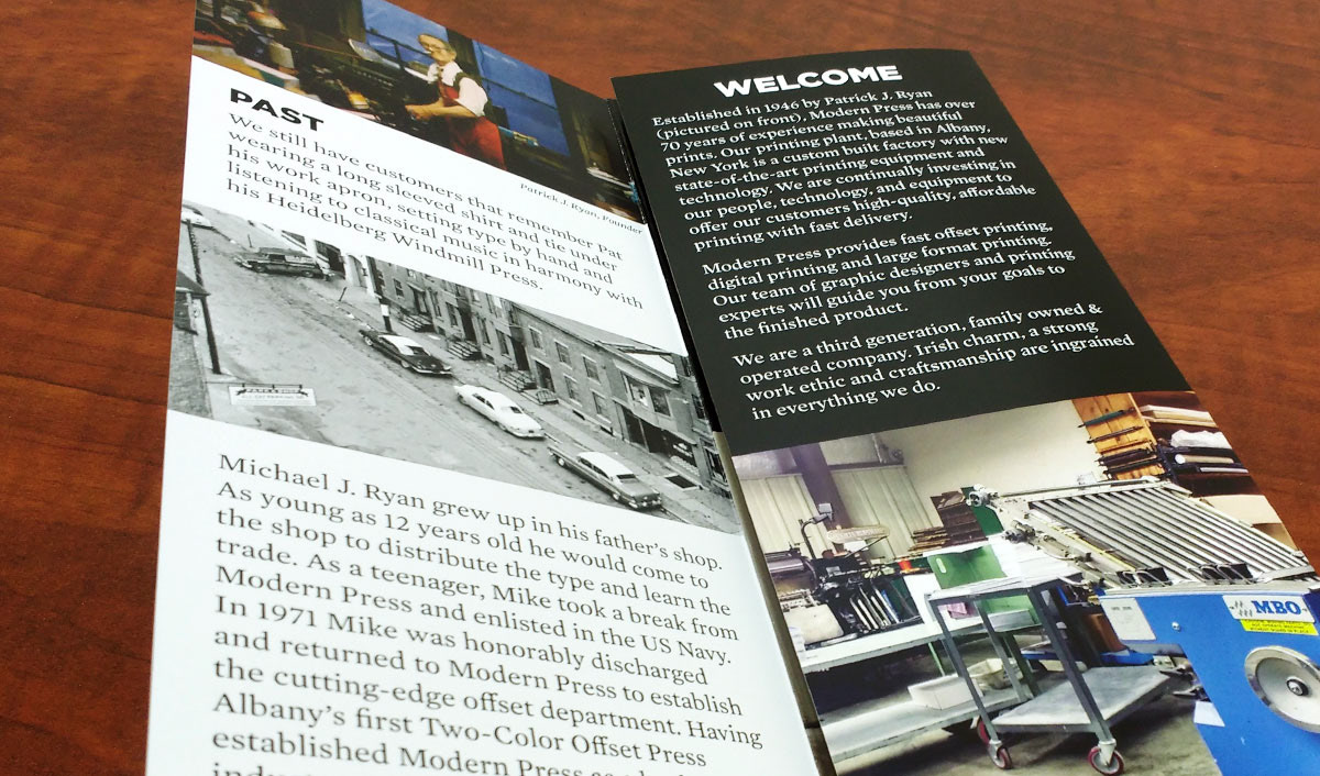
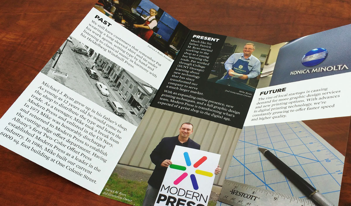
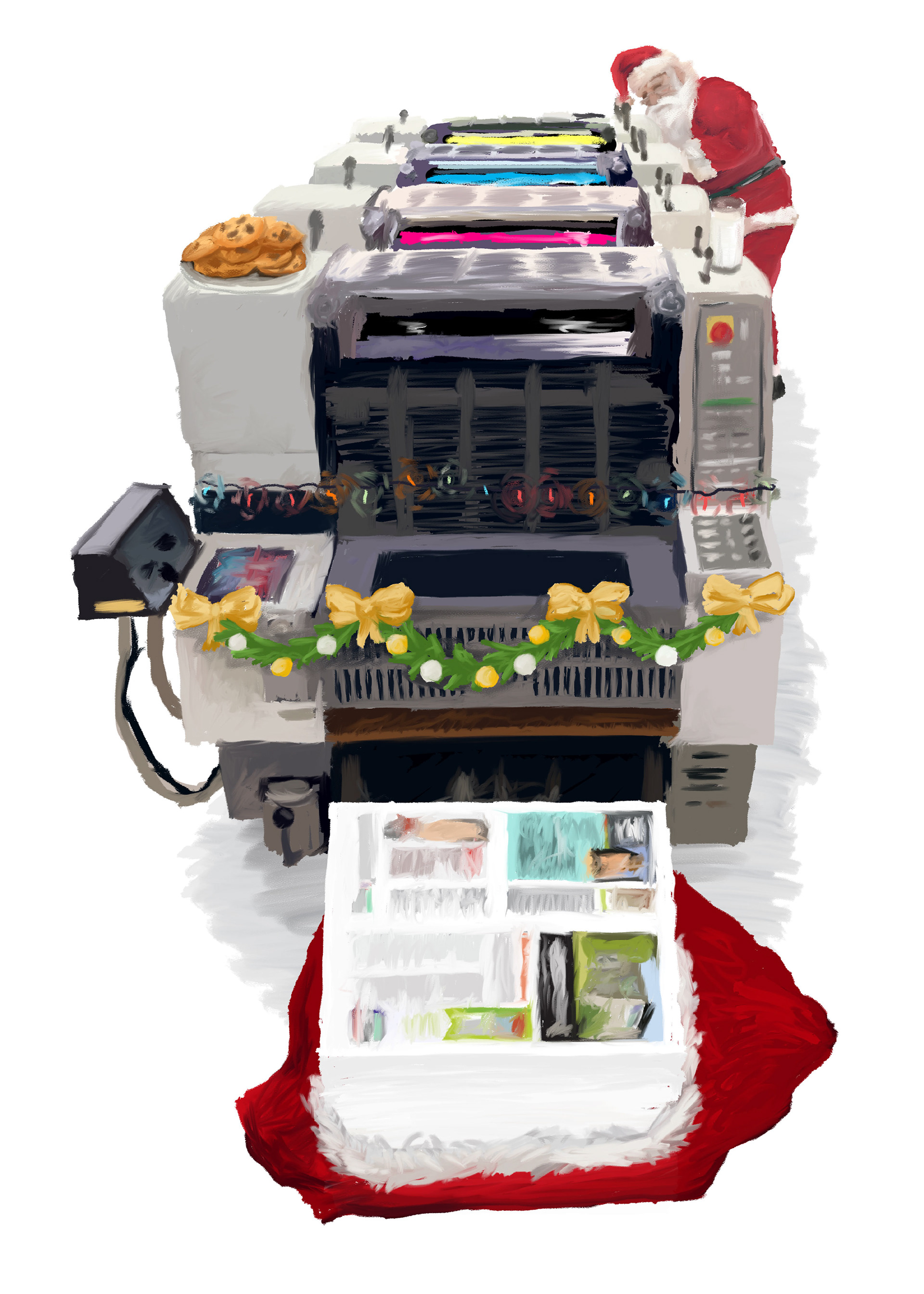
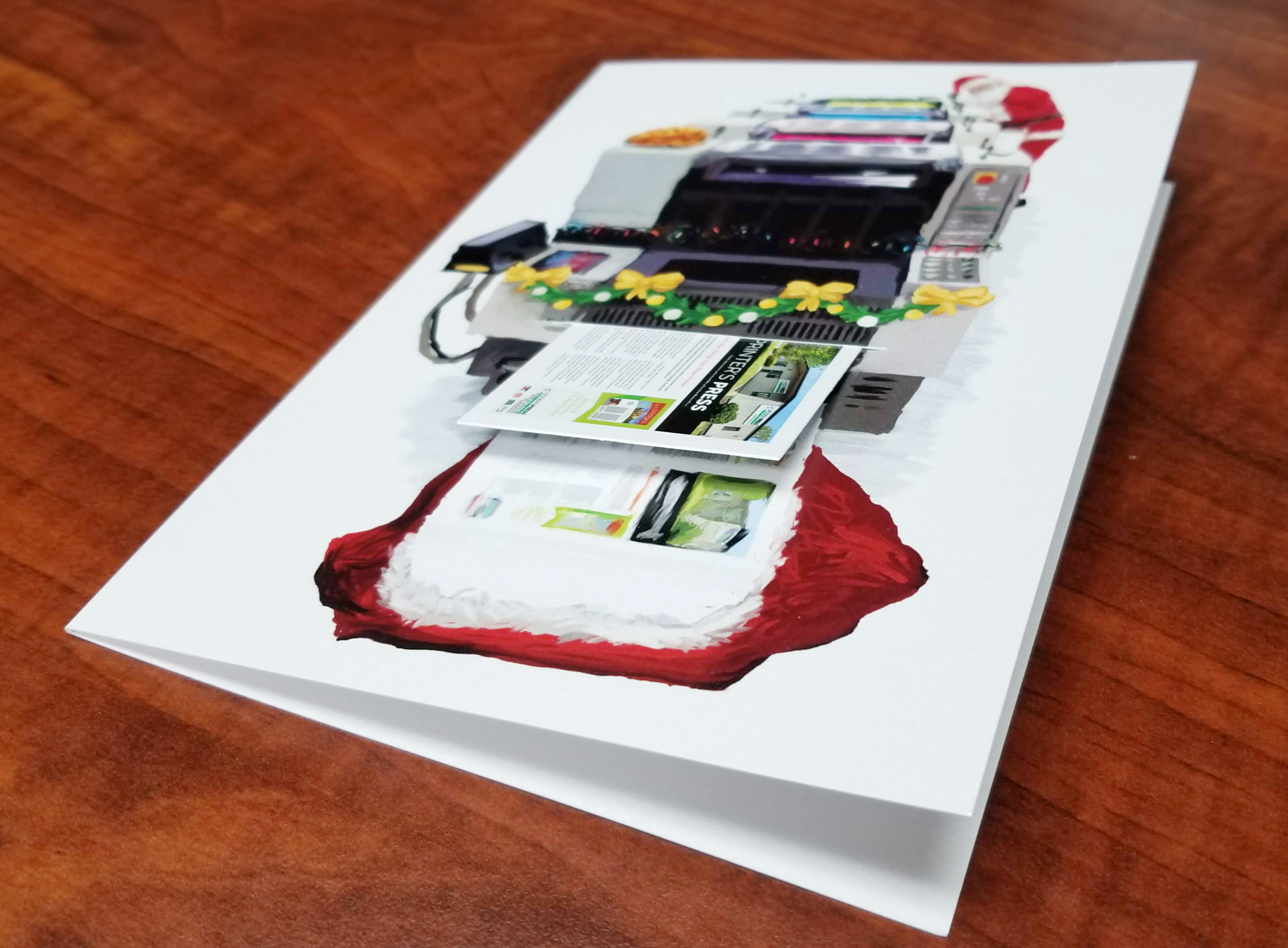
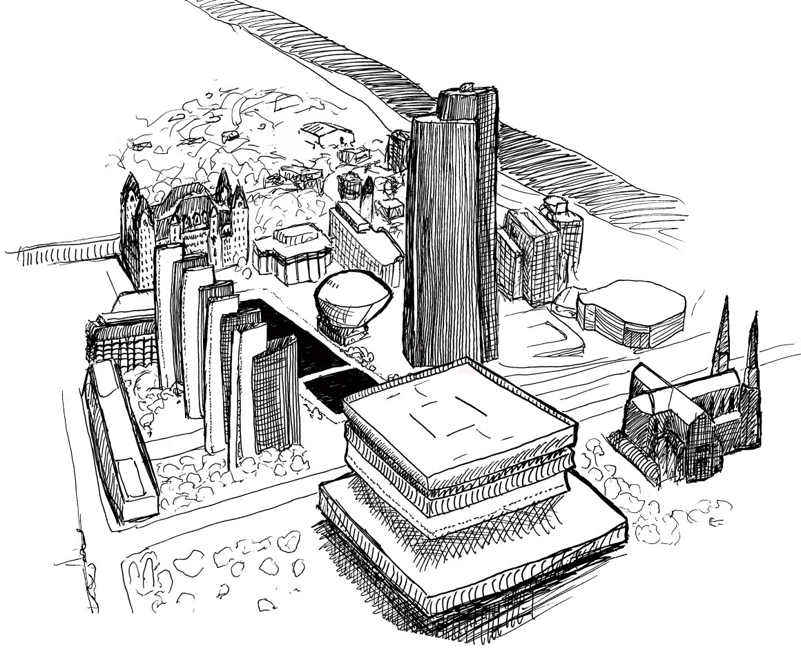
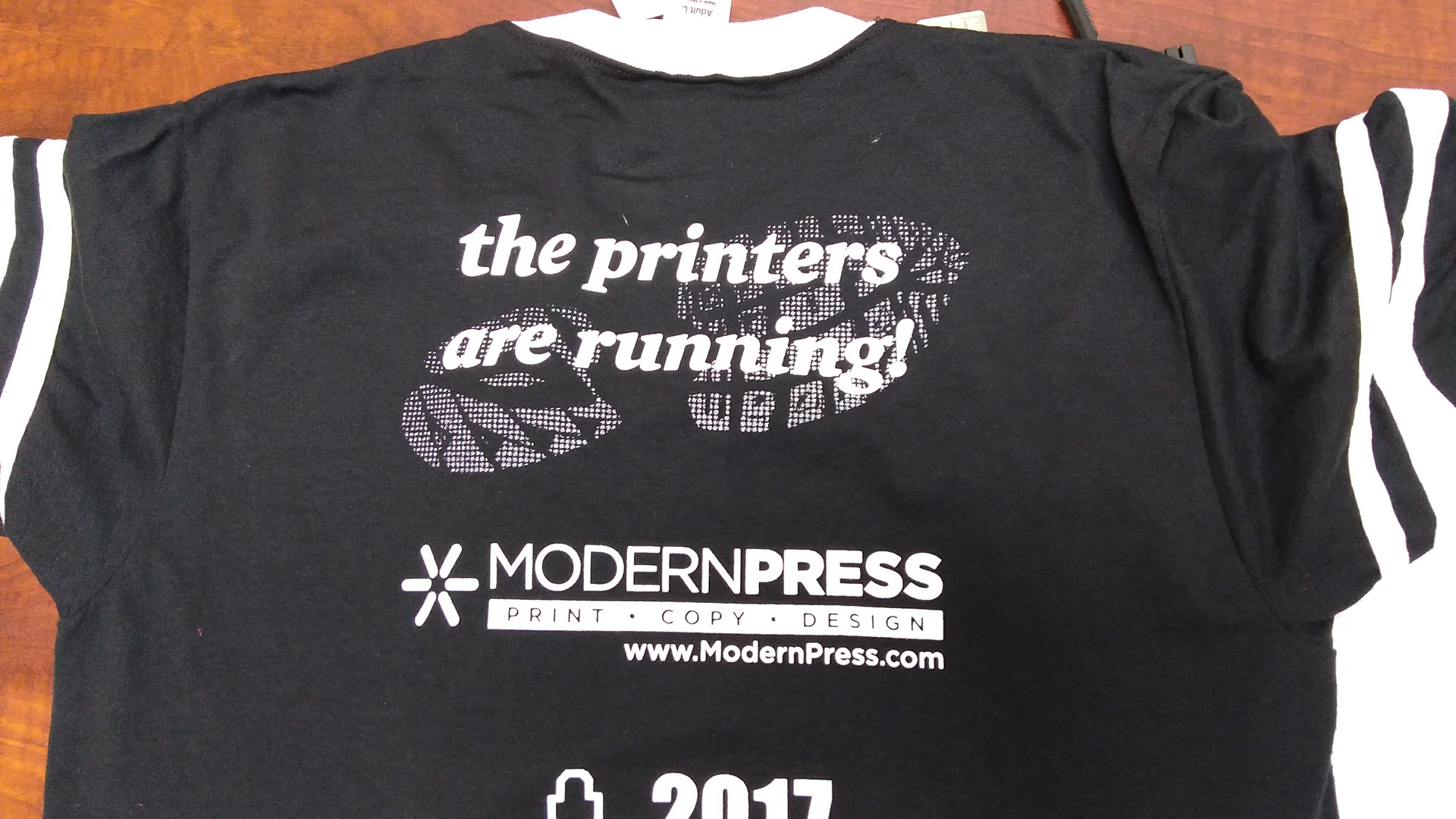
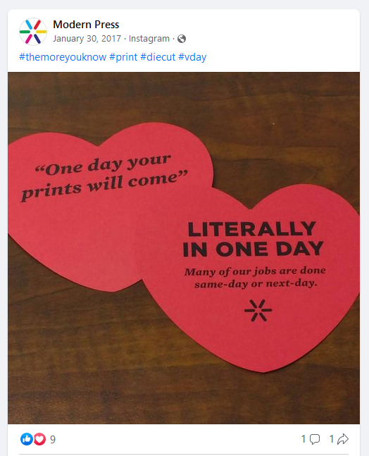
Once the logo was finished, I began focusing on the rest of our visual identity. Our previous brochures were full of generic stock photos and clipart. Searching through old company photo albums, I gathered some pictures from the past, and took some photos of our actual printing and bindery equipment. In an effort to keep a friendly and casual tone‑of‑voice and visual identity, I also began integrating more puns and original hand‑drawn elements into our marketing materials.